Colour and Workplace Productivity
 Contributed by
Amy Picanço
August 22, 2016
Contributed by
Amy Picanço
August 22, 2016
These days, businesses are looking for every advantage to maximize productivity in their organisation.
I explored the trend towards the open office design and how businesses are using office layout to get the most out of their workforce. Many business leaders are discovering that office layout is just one aspect of how a modern office design can lead to increased productivity. Some research studies are showing that the office colour scheme can have a direct impact on employee performance. So when drawing up designs for that new office space, you should give serious thought to not only how your employees will be stationed but also what colour scheme will surround them during their workday.
The Relationship Between Colour And Mood
The fact that colour can affect our mood is not anything new. Psychologists have been demonstrating for decades that the colours we are exposed can have a substantial impact on our mood and attitudes. While there are no hard and fast rules, here are some guidelines for how colours can affect employees in the workplace:
Grey
This colour is often found in professional office settings due to the belief it is a neutral color and anything neutral can’t be all that bad. As it turns out, grey is perhaps the worst color to use in the workplace. It has been found to lead to feelings of nothingness and depression, particularly in women.
Blue
Generally considered a soothing, comforting and trustworthy colour. It suggests a feeling of peacefulness and reliability. Blue is the most common colour used in corporate offices and product branding. Think of Facebook, Twitter and LinkedIn who all cleverly utilise this dependable tone.
Red
This bold colour should be applied with care. Red often creates a sense of urgency and is associated with excitement, movement, and passion. Red is also believed to stimulate the appetite which is why it is a common choice for fast food franchises.
Green
Similar to blue, green is associated with nature and tranquility. It is believed to stimulate harmony in the brain. For this reason, green is strongly connected to progressive causes, most notably the environmental movement. It is a common choice for NGA’s and other progressive organizations.
Orange And Yellow
These colors are generally associated with cheerfulness and optimism. In small doses, they can be used to stimulate enthusiasm. However, over-exposure to these colors can lead to feelings of anxiety.
Matching Colour With Specific Tasks
While the connection between colour and mood is not entirely new, there have been recent studies into how employees perform specific tasks when exposed to different colour schemes. Ravi Mehta and Rui (Juliet) Zhu studied this issue in 2009 and produced a report titled: Blue or Red? Exploring the Effect of Colour on Cognitive Task Performances. They discovered that employees exposed to a red work environment performed better at detail-oriented tasks which required great care and attention. Those exposed to blue performed better at tasks involving free thought and creativity.
Perhaps the most comprehensive study was conducted by Nancy Kwallek, Ph.D., director of the interior design program at the University of Texas in Austin. Dr. Kwallek tested people exposed to different colour schemes and found that some people were “high screeners” and could block out their surroundings. Those who were “low screeners” performed better in softer blue and greens than bright bold colours such as red or orange. She also found that most subjects made the most mistakes when working in the white environment.
Quick Recommendations
- Choose a blue or green color scheme for the general office setting.
- Go with a blue/yellow combination for areas designated for creative tasks such as brainstorming, pitching, or campaign development.
- Use red cautiously (don’t overdo it) in areas where employees are performing detail-oriented tasks.
- Avoid using gray or white as the base color for the general office setting.
By taking a strategic approach to your office colour scheme, you can bolster office morale and increase productivity. For a more detailed account of how Aym Design can help you with your colour strategy, please feel free to contact me to arrange a consultation.
Visit Aym Design page to find out more about Amy’s work.

This post was first published on Aym Design blog and has been reposted on Executive Lifestyle with the permission of the author.
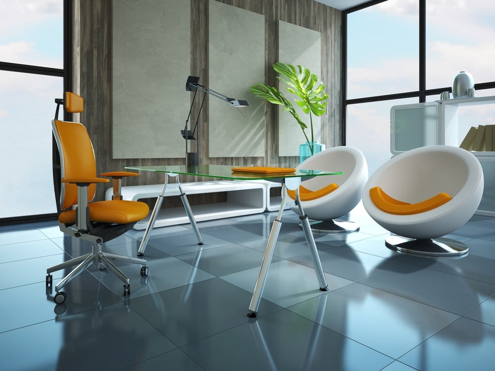
Image credit: Part of the modern office 3D rendering from Shutterstock
Edited by Monina Euginio
Did you enjoy this post? Please comment, like and share!


Sorry, the comment form is closed at this time.